
Editor’s note: Brett Borchardt, a Data Quality Analyst in the ARM Data Quality Office at the University of Oklahoma at Norman, sent this update.

Every week, data quality analysts working in the ARM Data Quality Office sift through thousands of days worth of data collected by instruments worldwide in search of even the slightest hint of a looming instrument problem.
The work is tedious but honest, thorough, and sometimes tricky. All the while, being an ARM data quality analyst is fulfilling, as it provides learning opportunities outside of the classroom on topics such as physical meteorology, measurement systems, and programming.
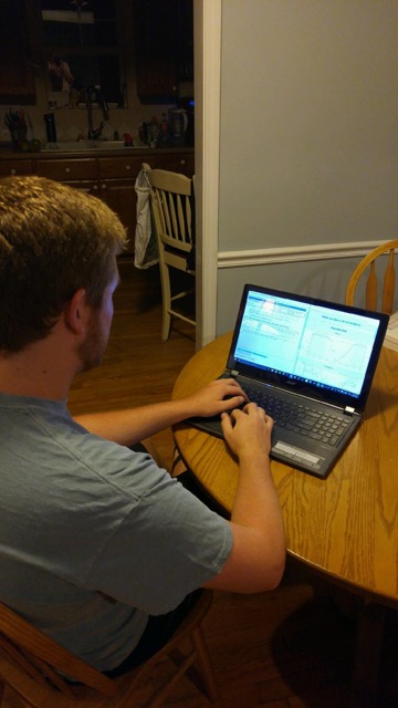
A normal shift for us starts by pulling up the instrument dashboard—an in-house, web-based product that generates a list of an analyst’s assigned instruments—as well as keeps track of each data quality assessment report submitted every week.
Every data quality assessment report, or DQA, is submitted in seven-day stretches, covering the days from any given Saturday to the following Friday. When submitted, the DQAs are emailed to each analyst, the mentors for the instrument, and technicians at corresponding sites. DQAs allow for complete and continuous records of the data and are considered as the first ‘safeguard’ against suspect data. At the start of the week, every assigned instrument will require a DQA for the preceding week’s data.
Looking for Suspect Data
For me, I usually start with instruments that are part of ARM mobile facilities, such as the ARM West Antarctic Radiation Experiment, or AWARE, campaign.
Since the data are of high importance and demand, it is critical that problems with onsite instruments are identified quickly so that data collection is impacted as little as possible. As such, I try to check the instruments every other day—even on weekends.
For example, one of my instruments in Antarctica is the MET—Surface Meteorological Instrumentation—which collects surface wind speed, wind direction, air temperature, relative humidity, barometric pressure, and rain rate at a one-minute resolution. I first pull up daily metrics for the instrument, which graphically display time periods during which automated data quality algorithms indicate good, missing, suspect, or bad data.
Most of the time, the metrics indicate that the data are good. In cases where the metrics highlight a period of suspect data, I am not quick to call the data automatically bad.
It is important to understand the instrument and its location, as set parameters for the algorithms are not always perfect. For example, temperatures in Antarctica are quite cold (no surprise!), resulting in the air temperature sometimes being flagged as being “too cold” in the metrics when it is correct and corroborated by other instruments onsite. Indeed, the human element of data quality work is important.
Then Comes the Data Analysis…
After examining the metrics, I open up the instrument’s DQA and start going through each day of data. Since I have been looking at data from the MET for some time, it does not take long to go through each day to ensure the data quality is okay.
There are basic rules of thumb, such as how temperature and relative humidity should share an inverse relationship, or how the wind direction can be erratic when the wind speed is very calm. I make note of any instance of suspect data in the DQA report; however, this week, the data look good. I submit my DQA with no notes and move onto my next instrument.
However, not every instrument is as simple. For the more complicated sets of data, data quality analysts often refer to a specific instrument’s ‘wiki’ web page. The wiki can be the lifesaver as the web pages house a plethora of information ranging from expected data to past problems. I often refer to the wiki when I recognize suspect data, but am unsure of what may be the cause. At the same time, I am sure to add information to the wiki if it is not already present.
In cases where something definitely appears wrong with the data, analysts submit Data Quality Problem Reports, or DQPRs. Problem reports allow for collaboration between the Data Quality Office, instrument mentors, and site technicians to identify and fix problems, ultimately pinpointing the exact minutes of a day data are affected.
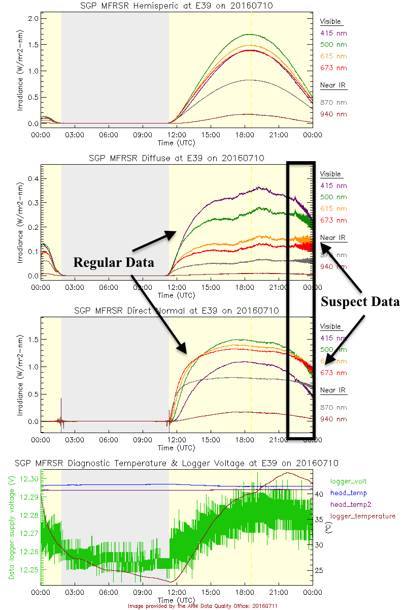
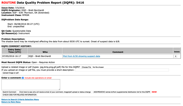
This week, I submit one for an MFRSR, a multifilter shadowband radiometer at the Southern Great Plains (SPG) site. The shadowband looked to be slightly off, making the irradiance data quite noisy during the afternoon hours. This is a fairly typical problem that is easy to fix. In my average week, I submit one to two DQPRs, but have had weeks where I’ve submitted them in the dozens.
Each analyst has 20 to 60 plus instruments, depending on their course load during the semester. After all, most data quality analysts with ARM are full-time undergraduate students. The routine is easy to implement:
- Open up an instrument’s metrics.
- Look at the data and make notes of suspicious data in the instrument’s DQA.
- If a problem is suspected, investigate on the instrument’s wiki web page and possibly issue a DQPR.
- Move to the next instrument.
Not for the Squeamish
While most of the time the data are just fine, data quality analysts sometimes find interesting or plainly unusual data. In my time with ARM, I’ve had to deal with spiders nesting in my instruments, seen the effects of nearby wildfires, analyzed extreme rainfall events, and documented instances of polar bear damage to buried cables. The job can certainly bring surprises!
In all, ARM data quality analysts have efficient ways to track and document instances of data corresponding to the good, bad, and ugly. While to an outsider the work may seem somewhat monotonous, ensuring the quality of data requires full attention (and interest) to spot slight discrepancies that if not addressed could fester into larger, potentially more expensive, problems.